Plot Vector Data
Contents
2. Plot Vector Data#
Attention
This instruction is for the Modern Mode in GMT 6. For making the same map using the GMT 6 Classic Mode or GMT 4-5, Please go to this page.
Geospatial data are often stored as a raster or a vector format. The so-called vector data describe the locations and the shapes of points, lines, and polygons. We have mentioned how to plot point data in the chapter Scatter Plot, and in this chapter we are going to show you how to plot line segments and polygons using GMT. In addition, we will also describe a bit about the GMT-compatible vector file format, and how to set up transparency – a useful way to illustrate a map with many layers of vector data.
2.1. Goal#
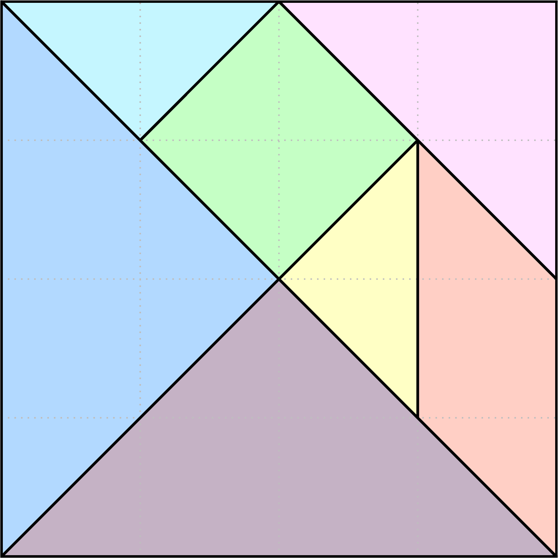
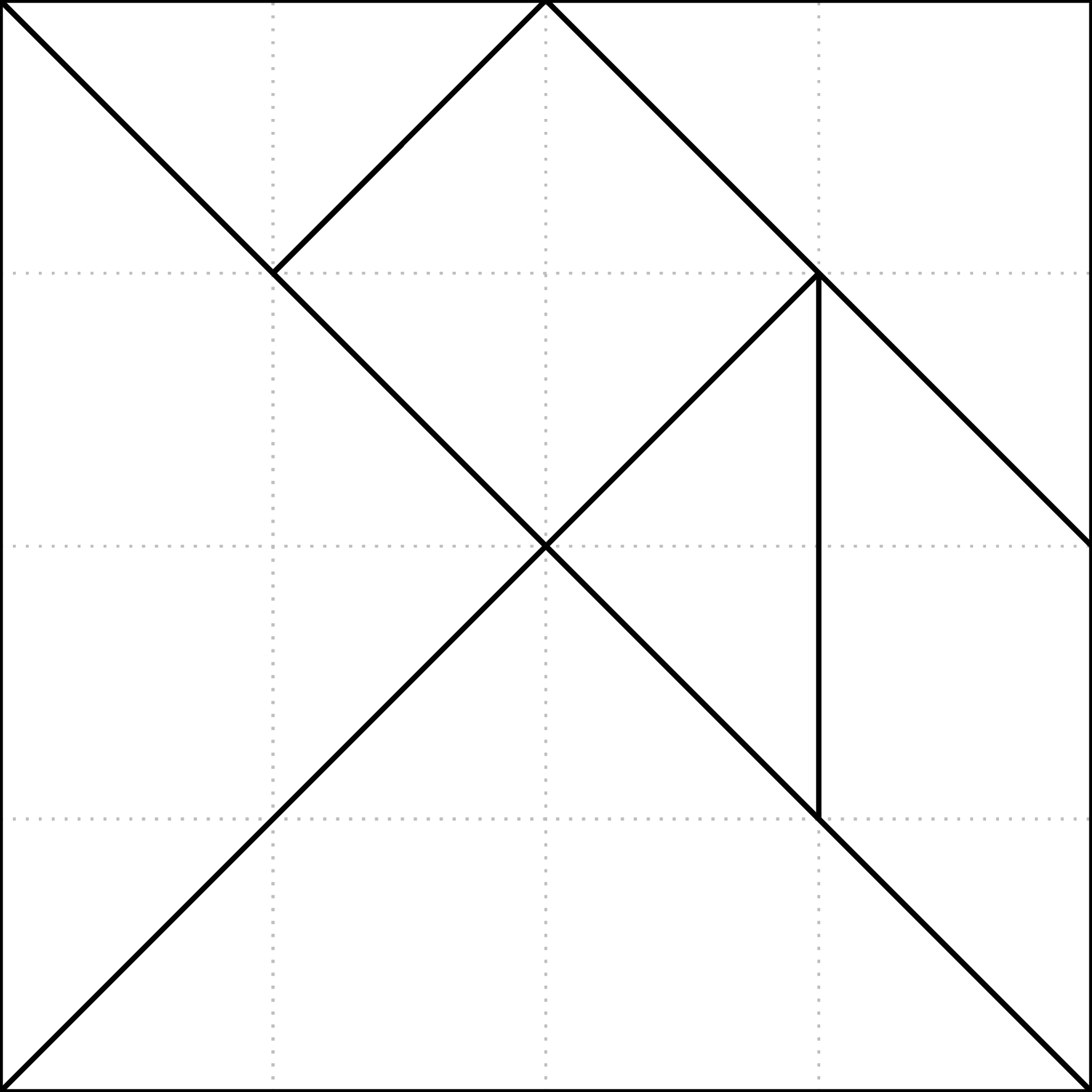
Draw a tangram like this one. The tangram is a dissection puzzle and your goal is usually to combine all 7 pieces to form the assigned figure. Here the figure is a square, the most basic one among all possible figures.
In this figure, each polygon piece has a distinct color and a black edge. Also on the figure are pale-gray grid lines that can help to calculate the area of each polygon. To make all of them appear on a single figure, we have to add the transparency settings to the colormap using an additional option for makecpt.
Go to the final Script
2.2. Commands and Techniques#
makecpt- make a colormap with transparency settingsbasemap- set up info of the mapping areaplot- plot segments and polygons
2.3. Procedure#
In Scatter Plot, we have seen how plot deals with point data. For processing segments and polygons, we can use the same plot syntax:
$ gmt plot input_file [-options]
As its name suggest, a segment is just a connection between two or more points (vertice). GMT accepts segment data in text (ascii) format as follows:
# (all lines starting with \"#\" will be interpreted as comments)
> [settings of segment 1]
segment 1, vertex 1
segment 1, vertex 2
...
> [settings of segment 2]
segment 2, vertex 1
segment 2, vertex 2
...
> [settings of segment 3]
...
If you are plotting a 2-D segment, your vertices would take 2 columns, which are X and Y coordinates respectively. Every segment must have at least 2 vertices. The > symbol is used to separate each segment, and after that we can add -W or -Z settings in the same line. They indicate the drawing options for the corresponding segment:
-W: specify pen style-Z: specify color by giving a value (which will be later linked to a colormap)
For detailed information, please go to this page. Now let’s take a look at how to design the segment data for the background grid lines on the tangram figure:
> -W3p,black,.
1 0
1 4
>
2 0
2 4
>
3 0
3 4
>
0 1
4 1
>
0 2
4 2
>
0 3
4 3
There are 6 segments in this file; the first three are vertical, and the last three are horizontal. Take the first segment for example, it is a segment from coordinate (1, 0) to (1, 4). To the right of the > symbol of the first segment, we can see a -W option, which means this segment would be plotted as a black, dotted, 3-point wide line. There are no options associated with all the other > symbols. When plot is reading this file, it would automatically use the previous value for the next segment. Hence, all the other segments will use the same line style from this first segment. Save this file as lines.txt, and enter the following command to plot the background grid.
$ gmt plot lines.txt -R0/4/0/4 -JX15c -png lines
Looks not bad! Now it’s time to deal with the polygons. In fact, the polygon data format is very similar to the segment data since it also records only the vertices in the file. However, you have to have at least three vertice to form a polygon. The GMT-acceptable polygon format is like this:
> [settings of polygon 1]
polygon 1 vertex 1
polygon 1 vertex 2
polygon 1 vertex 3
...
> [settings of polygon 2]
...
We can also add -W, -Z, and/or -G options after the > symbol (see this page for details):
-W: specify pen style for polygon edges-Z: specify a filling color by giving a value (which will be later linked to a colormap)-G: specify a polygon filling color directly
For example, we can use the following content to draw all the polygons in a tangram:
> -Z0
0 0
2 2
4 0
> -Z3
0 0
2 2
0 4
> -Z6
0 4
1 3
2 4
> -Z9
1 3
2 4
3 3
2 2
> -Z12
3 3
2 2
3 1
> -Z15
3 1
3 3
4 2
4 0
> -Z18
2 4
4 2
4 4
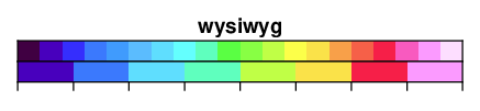
The first polygon is the triangle at the bottom of the tangram. Its vertices are (0, 0), (2, 2), and (4, 0). You can try to figure out what other polygons represent what shape! Note that for each polygon, there is a -Z setting after >, which means GMT will automatically fill the polygon using this as the value to looking up the color from the colormap. There is a built-in colormap in GMT called wysiwyg 1, very suitable for categorical filling like this case. Here’s its color combination:
Save the text as pieces.txt and make the figure using these commands:
gmt begin pieces png
    gmt makecpt -Cwysiwyg -T0/20/1    # colormap range is 0 to 20, sampled with an interval of 1
    gmt plot pieces.txt -R0/4/0/4 -JX15c -L -C
gmt end
Note that the -L option would tell plot that we are drawing polygons, and then plot would close the segments to form polygons. Also, when plotting polygons the default behavior of plot command is to draw edges only instead of color filling. Therefore, we need to add -C telling GMT we are filling these polygons using the newly made colormap.

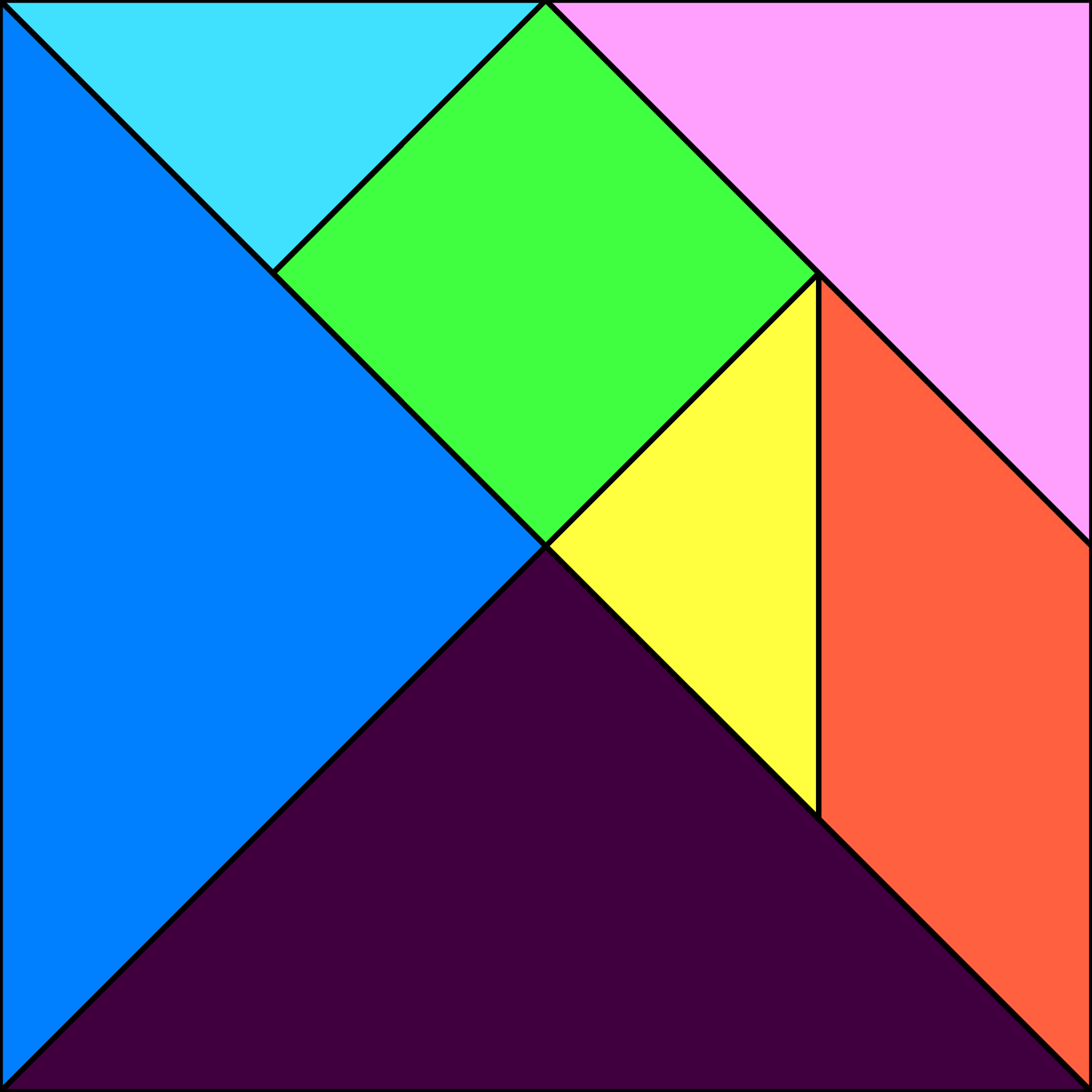
Now this tangram is really fleshing out! Here we are also adding the edges:
gmt begin pieces png
    gmt makecpt -Cwysiwyg -T0/20/1
    gmt plot pieces.txt -R0/4/0/4 -JX15c -L -C -W2p,black
gmt end
Almost perfect. There is only one little thing: the line at the edge of the figure seems thinner than the edges of the polygons inside the tangram. This is because GMT cuts the image by the edge of the polygons instead of the edge of the black lines; therefore, the edge width would be only half of the original width. If you think this is ok, great; but if you are a perfectionist and don’t want to see the lines not consistent in width, here’s another way for you: add the polygon edges to lines.txt as segment data so that they will be plotted with the grid lines. To do this, open lines.txt and add more lines at the bottom:
> -W1p,grey,.
# Note tht I changed the style of the grid lines!
1 0
1 4
>
2 0
2 4
>
3 0
3 4
>
0 1
4 1
>
0 2
4 2
>
0 3
4 3
> -W2p,black
0 0
4 0
4 4
0 4
0 0
>
0 4
4 0
>
0 0
3 3
>
3 1
3 3
>
1 3
2 4
>
2 4
4 2
The last half part (starting from > -W2p,black) is the polygon edges in the tangram. Let us retry these commands:
$ gmt plot lines.txt -R0/4/0/4 -JX15c -png lines
Ok now it looks much better. Our last problem is to add all lines and polygons together on this figure without blocking any of them. We can simply set up a colormap with transparency settings and solve this problem. The -A option of makecpt is used to specify transparency. Let’s enter this on the terminal:
$ gmt makecpt -Cwysiwyg -T0/20/1 -A70   # -A: %70 transparent
0    64/0/64@70    1    64/0/64@70
1    64/0/192@70   2    64/0/192@70
... (skipping)
In the colormap information, the number after @ is the transparency value. The full format of color thus becomes R/G/B@Transparency. Use this colormap for drawing the figure and you will see all the colors being transparently painted. Seems cute, doesn’t it?
2.4. Script#
The final script for the image is:
gmt begin tangram_gmt6 png
    gmt makecpt -Cwysiwyg -T0/20/1 -A70
    gmt basemap -R0/4/0/4 -JX15c -Bnews    # setting the axis ranges (-R) while not plotting the axes themselves (-Bnews)
    gmt plot pieces.txt -L -C
    gmt plot lines.txt                     # filling first and edges later. This makes sure the lines would be on the top, above the filling. You can try to move this line to an earlier place in the script and see what the transparency settings can do.
gmt end
The segment data lines.txt are as follows, and are available for downloading here.
> -W1p,grey,.
1 0
1 4
>
2 0
2 4
>
3 0
3 4
>
0 1
4 1
>
0 2
4 2
>
0 3
4 3
> -W2p,black
0 0
4 0
4 4
0 4
0 0
>
0 4
4 0
>
0 0
3 3
>
3 1
3 3
>
1 3
2 4
>
2 4
4 2
The polygon data pieces.txt are as follows, and are available at here.
> -Z0
0 0
2 2
4 0
> -Z3
0 0
2 2
0 4
> -Z6
0 4
1 3
2 4
> -Z9
1 3
2 4
3 3
2 2
> -Z12
3 3
2 2
3 1
> -Z15
3 1
3 3
4 2
4 0
> -Z18
2 4
4 2
4 4
Note
“Use wysiwyg as the master colormap and add transparency settings, and then draw tangram polygons with color filling, grid lines, and the edge of each polygon.”
Check the final figure
2.5. Exercise#
Draw a net of dice (6 faces). Use
wysiwygto fill each face with a different color.
- 1
What You See Is What You Get.